Tips to Improve your Website’s User Experience
Tags: User Experience,Web Design
eWay Corp June 20, 2022 2 MIN READ

Your website is the 24/7 salesman of your business. Especially in today’s marketing landscape, your website’s user experience has become the most powerful tool. Believe it or not, user experience has become the centerpiece and has the potential to be the core of all your marketing efforts.
Therefore, it’s important to design a site’s user experience to address the needs of the people you hope to attract to your online presence. But rapidly changing digital trends will mean you have to adjust or even overhaul your site as time passes.
To help you overcome this challenge, we’ve put together a few simple yet effective tips to improve your website’s user experience without breaking your bank.

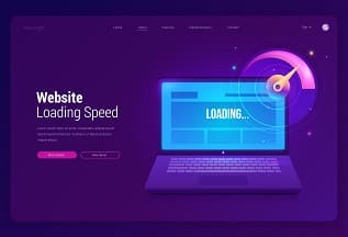
Page Speed Optimization
Do you have a higher bounce rate? Is your website’s slow page load interrupting the user experience?
Recent findings of Section.io indicate that a website’s “bounce rate” can increase by more than 20% with just an extra five seconds delay in page load time.
With increased mobile use, people are consuming content on many different platforms. And as a user yourself, even you’d have to agree that one of the most frustrating user experiences is to wait for a page to load for too long.
Irrespective of the platform we’re browsing, we always expect a fast result for the content that we want.
And obviously, if the user doesn’t get it, they usually bounce. Because more often than not, users simply don’t have the time to wait.
Scary? We know, but don’t worry, try these simple tricks to improve your load time on Mobile and Desktop.
- Compress all your images before loading them onto your website
- Know your target audience and use relevant and appealing content
- Use high-volume keywords
- Create multiple landing pages with unique content for different buyer’s persona
- Write attractive meta descriptions

Use Attractive CTAs
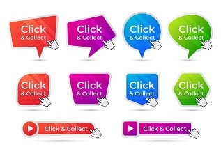
A recent study shows that using assorted color vibrations and action messaging can alone increase click rates up to 11%
Therefore, you must not ignore color and the psychology of color while creating CTA buttons for your website. Distinct colors evoke different sentiments. Think about the message you want to evoke in your user’s mind- trust, intelligence & experience. And for an optimal web user experience, design the CTAs accordingly.
A second thing to consider for your user experience strategy is the content you’re putting in those buttons. The words should excite the user to do something. Using action-oriented language always prompts the user to move forward.
The right words are the ones that make your audience identify with the product or idea. If people don’t feel an emotional connection to your message, they won’t do anything. So, choose words that are provocative and time-sensitive, and urge your audience.

Include a Segment Of Bullet Points To Showcase Key Information
Often overlooked, bullet points are a significant part of creating the best user experience. Why? Because it covers the user’s pain points, benefits, and key features of your service/product — all in a short amount of time.
To put it simply, it enables the user to quickly get all the information they want while making your propositions more attractive at the same time.

Get Creative With Your Images
To create a great web user experience design, it’s important to communicate with your customers in a way that’s authentic, understandable, and relatable.
You want to make sure that people feel like they are entering your world. It can be overwhelming for people when they first visit your site to look at the same generic stock photos they’ve seen elsewhere.
Using stock photography can decrease trust and also stand out as generic and non-unique. This can be frustrating for both you and your customers.
Your users may find it difficult to establish a connection with your brand, services, and products you offer if they don’t see images that represent what you are trying to convey.
A variety of custom images throughout your website can help them feel more at ease and also trigger an emotional response when they’re exposed to them.

Try Out Catchy Headlines
Predominantly, search engines give headings more weight over the content body. Thus, choosing the right heading would make it stand out. Which can further improve your search ability significantly.
So, as a part of the user experience principle, your headings and content must be targeted and should represent everything a potential customer is looking for. From an SEO standpoint, including keywords in your title is of paramount importance. As this will help attract the right audience.
Because ultimately, headings guide your user through the site, making it easy for them to scan and find content that speaks to them directly.
Don’t Compromise With Your Web Page Consistency
Consistency is everything. It is vital to any website’s user experience. Coloring, heading sizes, font choices, theme, button styles, spacing, illustration, design elements, style of photos— everything should be themed & designed to make your design coherent between every page & sub-pages.
The inconsistent design creates confusion among the audience. Drastic design changes from one page to the other can lead your user to feel lost and confused and to lose trust in your site. And when that happens, more often than not they tend to leave.
Structured, informative, and consistent navigation creates a beautiful user experience journey.
It’s important not to see user experience design as a ”set it and forget it” exercise. Hopefully, these tips have given you some ideas on how you can revamp your website to enhance the user experience without shelling out the dollars on a complete redesign.
If you’re looking for additional help, eWay Corp is just a call away. Our highly-trained team will help you put together an attractive, clean web design with a highly optimized user experience.


