Boost your Conversion Rate With these 5 Web Design Principles
Tags: CRO,Web Design
eWay Corp June 23, 2022 2 MIN READ

According to research conducted by True List, 90% of online shoppers say that they immediately leave sites with bad web design. Additionally, the average internet user forms an opinion about a website in less than a second, and 75% of users will judge a brand’s credibility based on their website alone. All of this means that the way your online store looks can greatly impact your bottom line.
Although we’d all like to believe that we shouldn’t judge a book (or a website) by its cover, the truth is that an aesthetically pleasing design is critical to success in eCommerce. A well-designed UI alone can increase conversion rates by over 100%!
If you want to start increasing your store’s conversion rates, you can begin by following these 5 basic web design principles.

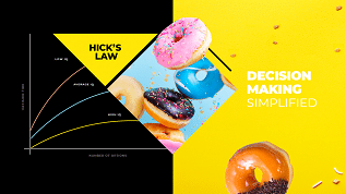
Follow Hick’s Law
Hick’s Law is a psychological principle that theorizes that the more choices a person is offered, the longer it will take them to plan. Great web designers utilize this effect by limiting the number of actions a customer can take on a certain page, such as having a single CTA button above the fold to encourage more people to click.
Now, this doesn’t mean your store shouldn’t offer plenty of products and customization options. You can make your product catalog as plentiful as you like, with dozens of categories for customers to sort through to find exactly what they’re looking for. Instead, Hick’s Law should be applied to the customer’s navigational experience. For instance, limiting the number of options in the navigation menu or the number of CTAs per page can reduce user hesitancy and help increase conversions.

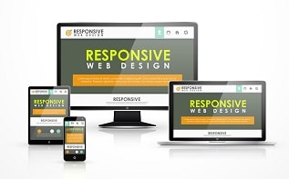
Use a responsive theme
Businesses can no longer afford not to go mobile-first if they want to increase conversion rates. Over half of all regular online shoppers browse on their mobile devices, so if your store isn’t optimized for smartphones and tablets, you could be missing out on a significant amount of your target audience.
We also recommend a responsive theme in particular so that the user experience will remain consistent no matter what type of device the customer decides to use. If they switch from their phone to their laptop, it should be a seamless transition. Although you could use a PWA or create your native app, it’s more streamlined and straightforward to have a consistent theme for all of your users.

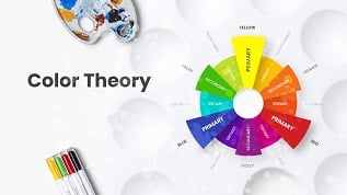
Learn about color theory & color psychology
The color scheme you choose for your website can be an unexpectedly powerful tool when it comes to attracting customers. The bright colors will accurately represent your brand and resonate with your customers, whereas poor color choices can negatively affect your company image.
Whether you’re redesigning your website or building a new store from scratch, here are just a few common colors that can convey some strong emotions:
- Red is associated with passion, love, drama, and power. It’s a great attention-grabbing color, so it’s often used for CTA buttons. However, using too much red on your site can come across as aggressive.
- Blue is associated with relaxation, peace, strength, and other calming feelings. It’s a comforting color that conveys trustworthiness, so it’s a common choice for many social media platforms, tech companies, and security companies.
- Green is a lively color that many people associate with health, wellness, and the environment. Green can be used to highlight the health benefits of a product, natural ingredients, or environmentally-friendly practices of a company.
- Yellow is associated with warmth, happiness, and creativity. Bright yellow is a great accent color and can be used to draw users’ attention to CTA buttons, whereas pastel yellow has a more calming effect.
Adobe’s free Color Wheel feature is an incredible resource for anyone trying to generate a pleasing color scheme for their website. The tool allows users to select specific color harmony rules — such as monochromatic themes or analogous color schemes — to generate harmonious color palettes in seconds. You can even upload your image to Color Wheel and it’ll generate a palette using the colors in your picture!
Upload original images
Using original pictures and graphics on your website can make a massive difference when it comes to your conversion rates. If your site has low-quality product images that were taken years ago or an excessive number of free stock photos, your audience will undoubtedly question the reliability of your company.
Invest in high-quality photos and original graphics for your brand. Have clear pictures taken of your products from multiple angles to give users a full view of everything you have to offer?
To further increase customer trust, consider adding photos of your team to your website. Genuine pictures of real people can make your brand feel more relatable than a company that seems to lack any human elements whatsoever. It also allows you and your team to show off your uniqueness!
Utilize negative space
White space — often referred to as “negative space” in web design — refers to any empty parts of your website. This includes the space between any elements of your page, such as the space between paragraphs, letters, headers, content, or CTA buttons.
Without negative space, a website would be horrifically cluttered and almost impossible to use. You’ll notice that most brands today seem to take a minimalist approach to web design to create a serene, streamlined experience. Utilizing plenty of negative space makes users zero in on the one main message you want to communicate without providing any room for distraction.
Need web design help?
If you’re not sure where, to begin with, your web design project, consider working with eWay Corp. Our web design agency creates beautifully customized and mobile-friendly eCommerce sites using modern SEO techniques, the best UI/UX practices, and the latest features to give brands the updates they deserve. Connect with a web design expert today to learn more and get started!


